TFC
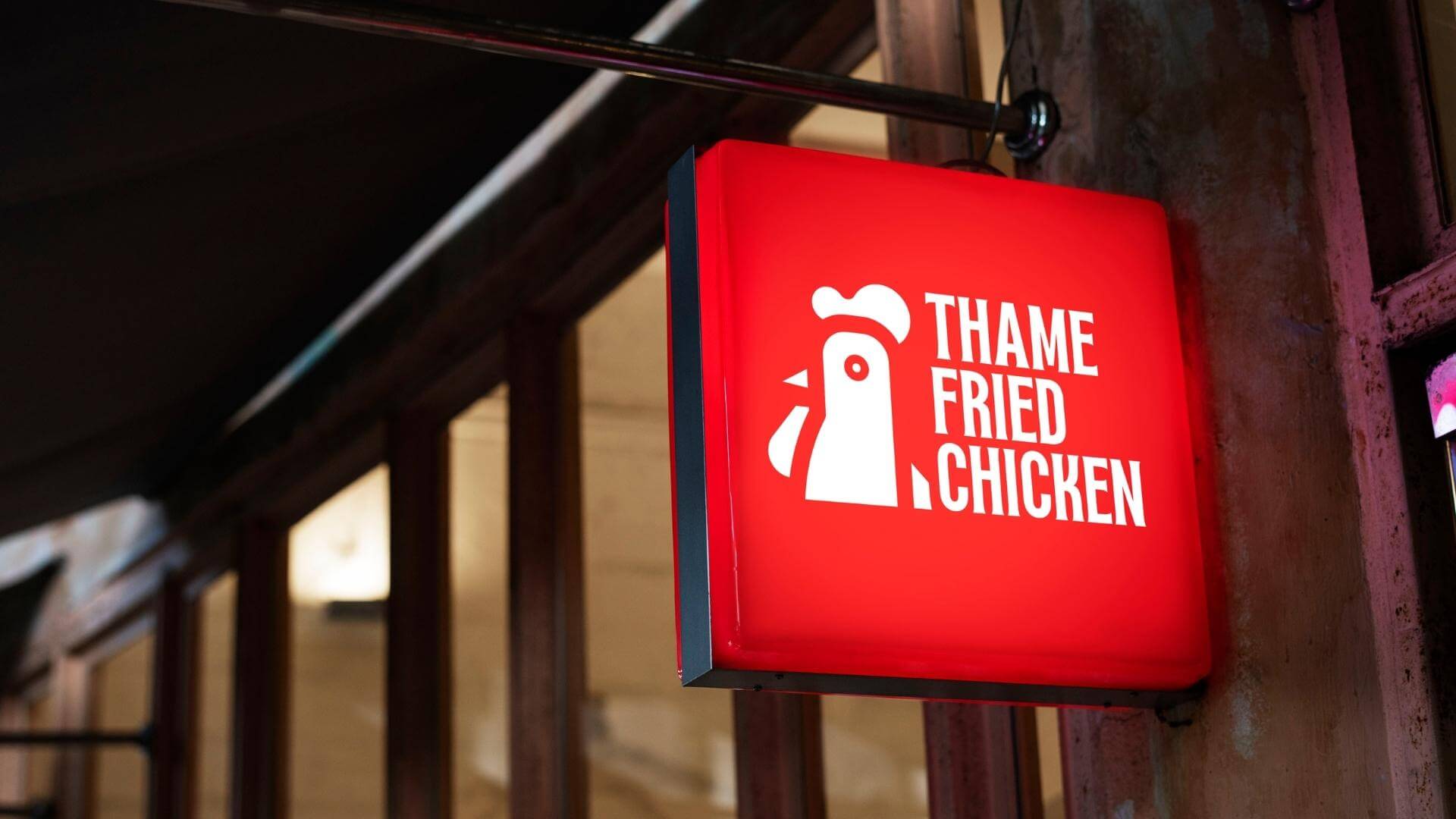
88 Creative’s in-depth rebranding and redesign of Thame Fried Chicken, Oxford’s leading fried chicken restaurant, showcases its expertise in creating a compelling and engaging visual identity. Through meticulous research and a deep understanding of the brand’s essence, they created a logo that perfectly summarizes the restaurant’s core values and offerings.
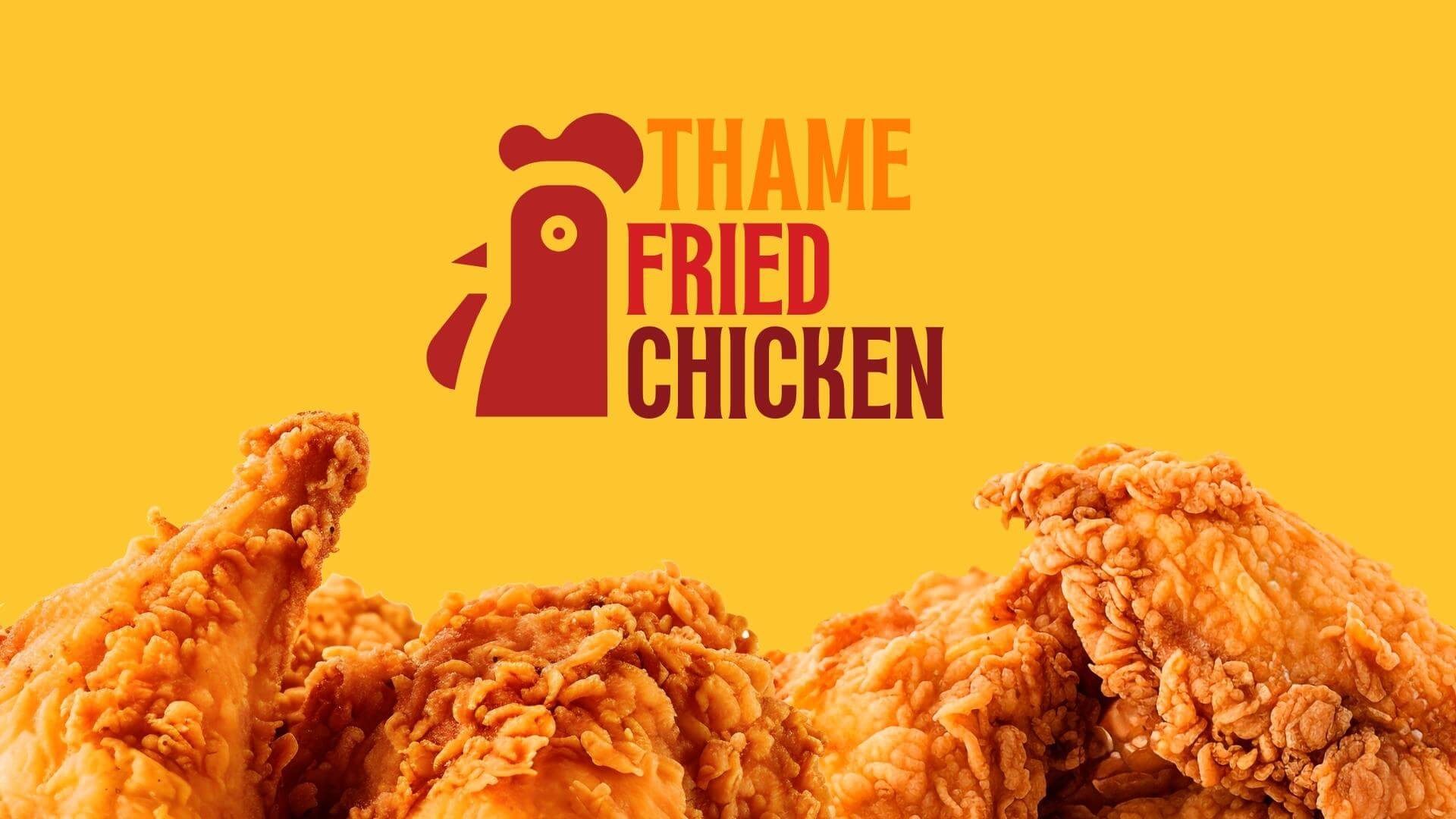
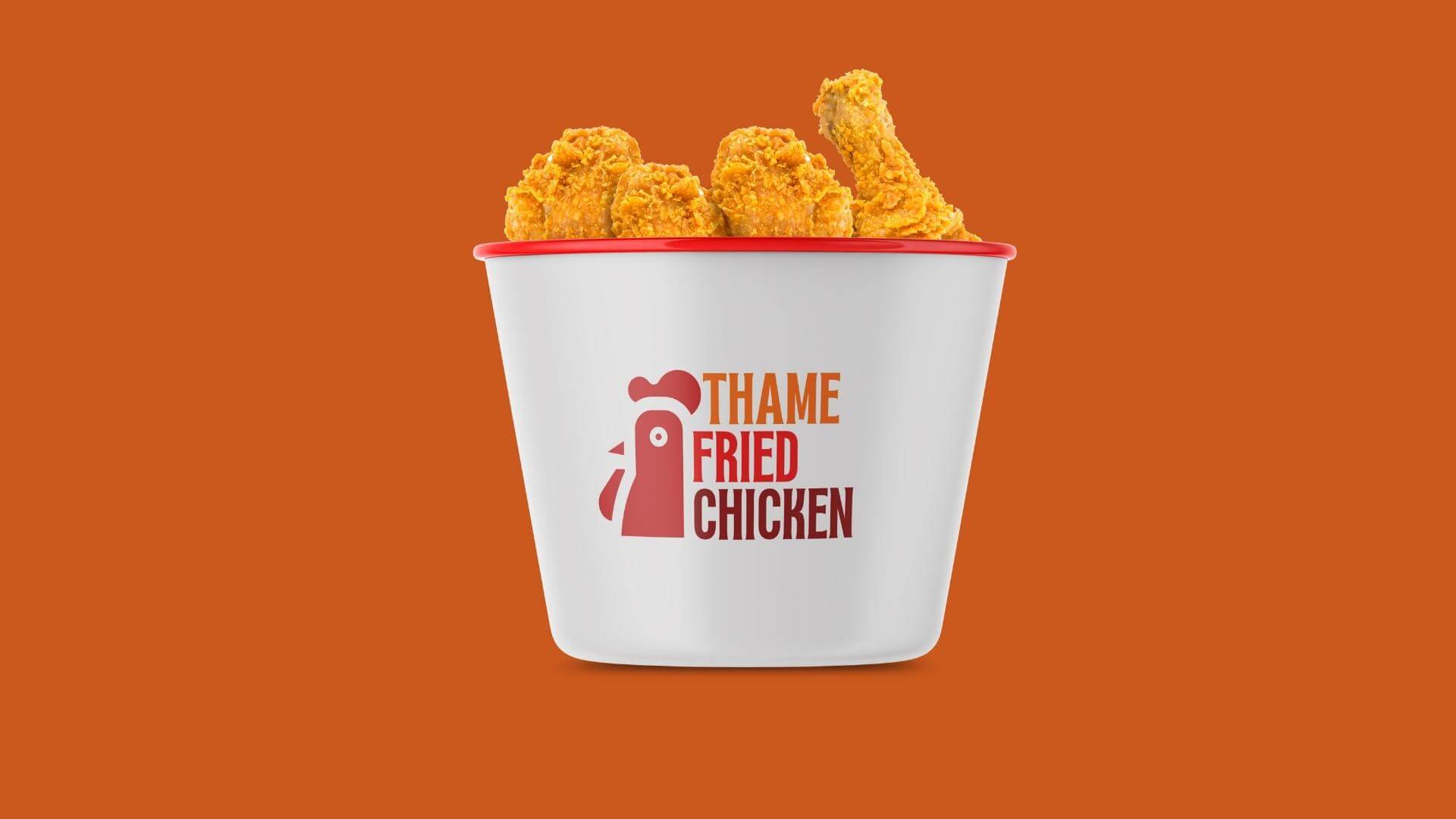
The warm orange, vibrant red and deep red colors chosen for the logo have been carefully selected to evoke specific emotions and associations that resonate with the target audience. The warm orange signifies an inviting and welcoming ambience, reflecting the restaurant’s commitment to providing an intimate and enjoyable dining experience.
On the other hand, vibrant red and deep red evoke excitement, passion and appetite, highlighting the mouth-watering and irresistible flavor of Thame Fried Chicken’s offerings. These bold and dynamic tones act as a strong visual cue, drawing customers in and creating a sense of urgency to experience the restaurant’s delectable menu.
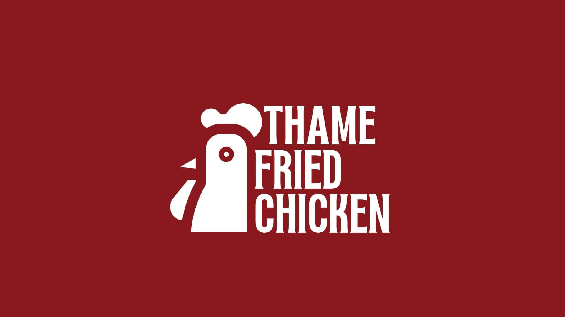
The redesign of 88 Creative’s logo shows the brand’s commitment to modern aesthetics while maintaining its authenticity. Combining classic typography with contemporary elements, they strike the perfect balance between tradition and innovation. This strategic approach ensures that existing customers feel strongly connected to the familiar brand, while attracting new, younger audiences who appreciate modern design.
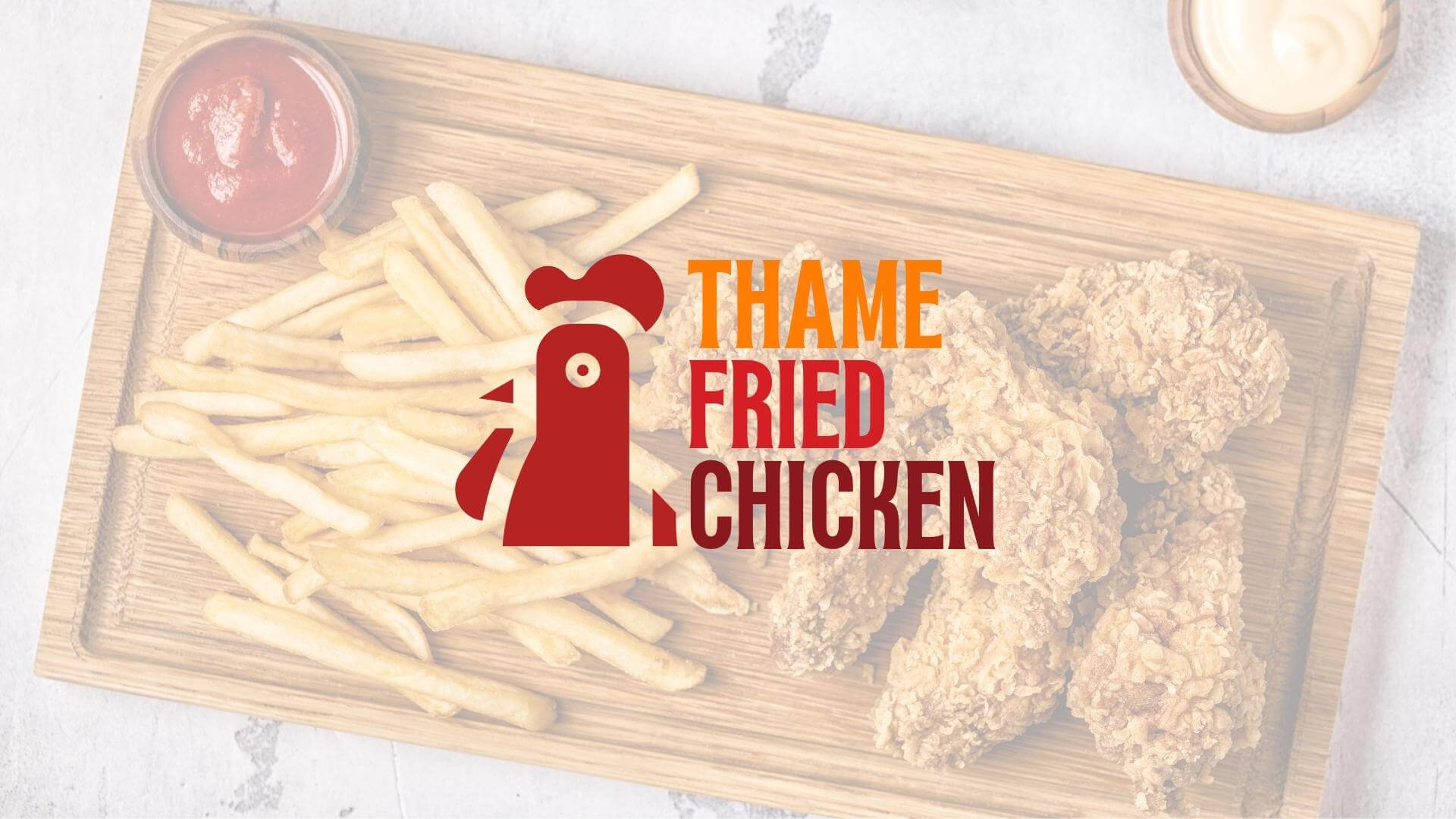
Their research also looks at the overall positioning of the brand and how the redesigned logo will resonate with the target demographic. It takes into account factors such as customer preferences, industry trends and competitor analysis to create a unique and distinct identity for Thame Fried Chicken.
The final result of 88 Creative’s work is a visually captivating and cohesive brand identity that sets Thame Fried Chicken apart as the best fried chicken destination in Oxford – UK. The logo’s warm orange, vibrant red and crimson color scheme, combined with a balanced combination of tradition and innovation, reinforces the restaurant’s status as a beloved local icon, while positioning it for continued success in a competitive market.
HizmetlerLogo Design, Photo Shooting, Package Design